You know that feeling when you buy a gorgeous piece of fruit, bring it home, and it suddenly looks… dull? Or maybe you put on your favorite outfit, step into the bathroom, and wonder why your skin looks a bit gray? It’s not you. It’s the light. For years, we’ve been told that a Color Rendering Index (CRI) of 80 is "good enough." But in 2026, that advice feels like using a flip phone in a smartphone world. It works, sure, but it misses the point entirely.
Lighting has changed. Our screens are sharper, our cameras are better, and our expectations for how our homes feel have shifted. We aren’t just looking for brightness anymore; we’re chasing fidelity. We want our spaces to feel alive, warm, and real. Sticking with CRI 80 is like watching a 4K movie on a standard definition TV. You’re missing the details that make life look, well, lifelike. Let’s talk about why it’s time to leave CRI 80 in the past and what you should be looking for instead.
The Hidden Flaw in the "Good Enough" Standard
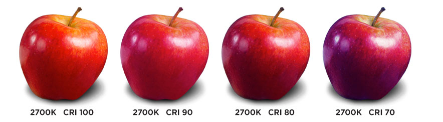
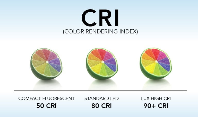
CRI, or Color Rendering Index, measures how accurately a light source reveals colors compared to natural sunlight. A score of 100 is perfect daylight. For decades, CRI 80 was the industry standard for general lighting because it was cheap and efficient. But here’s the thing: CRI 80 is based on an old testing method that uses only eight pastel colors. It completely ignores the rich, deep tones that actually matter in our daily lives.
Think about red. Real, vibrant red. The kind you see in a ripe strawberry, a glass of wine, or even the warmth in human skin. The old CRI test doesn’t really check for this. That’s where R9 comes in—a specific metric for saturated reds. Many CRI 80 bulbs have terrible R9 scores, sometimes even negative numbers. This means under those lights, everything with red in it looks muddy, brown, or sickly. In 2026, accepting this isn’t just a compromise; it’s a design failure.
We’ve gotten used to it, though. We’ve normalized the idea that our homes should look slightly "off." But once you see the difference, you can’t unsee it. High-CRI lighting doesn’t just make colors pop; it restores the natural texture and depth of objects. It’s the difference between a flat photograph and a 3D hologram. One is functional, but the other is an experience. And honestly, don’t we deserve our homes to feel like an experience?
The Efficiency Myth Is Dead
For a long time, the argument against high-CRI lighting was cost and efficiency. Manufacturers claimed that pushing a LED to CRI 90 or 95 meant sacrificing brightness or burning through more electricity. They said you had to choose: save money with CRI 80, or pay extra for quality. That trade-off made sense ten years ago. Today? It’s obsolete.
Recent advances in LED technology have shattered that myth. Modern phosphor mixes and refined chip architectures allow manufacturers to produce CRI 90+ lights that are just as efficient as their CRI 80 counterparts. Companies are now delivering excellent luminous flux at CRI 90 without the penalty. The thermal paths are better, the binning is tighter, and the engineering is smarter. The idea that you need to sacrifice efficacy for color quality is simply no longer valid.
In fact, many leading brands have made CRI 90 the new baseline standard. It’s not a premium upgrade anymore; it’s the expected norm. When you walk into a store in 2026, finding a CRI 80 bulb should feel like finding a VHS tape. It’s still there, but why would you buy it? The price gap has narrowed significantly, too. For just a few dollars more per bulb, you get a lighting system that makes your entire home look higher-end. It’s one of the cheapest renovations you can do.
Where CRI 80 Still Belongs (And Where It Doesn’t)
Let’s be practical. Not every corner of your house needs museum-quality lighting. If you’re wiring up the garage, the attic, or a utility closet where you’re just grabbing tools or storing boxes, CRI 80 is fine. Actually, it’s perfectly adequate. You don’t need to see the subtle undertones of a wrench. In these spaces, functionality rules, and CRI 80 gets the job done without breaking the bank.
But step into your living spaces, and the story changes. Kitchens, bathrooms, dining rooms, and living areas demand more. In the kitchen, food preparation relies on visual cues. Is that chicken cooked? Is that spinach fresh? Under CRI 80, colors are distorted, making it harder to judge freshness and doneness. In the bathroom, it’s about skin tones. We all want to look healthy, not washed out. A CRI of 90-95 ensures that makeup application is accurate and that you see yourself as others do in natural light.
Consider the dining room. This is where we gather, share meals, and connect. Lighting here sets the mood. Low-CRI light can make a beautiful meal look unappetizing. High-CRI light enhances the vibrancy of the food, making the whole experience more inviting. It’s a small detail that has a huge impact on how we feel in our homes. So, while CRI 80 has its place in the shadows, the heart of your home deserves better.
Beyond CRI: The Rise of TM-30
If you’ve been shopping for lights recently, you might have seen a new term: TM-30. What is it? Think of it as CRI’s smarter, more comprehensive older sibling. The Illuminating Engineering Society (IES) developed TM-30 because CRI was too limited. TM-30 uses 99 color samples instead of eight, giving a much fuller picture of how a light source performs. It provides two key metrics: Rf (Fidelity Index) and Rg (Gamut Index).
Rf is similar to CRI—it tells you how close the colors are to natural light. But Rg tells you something new: whether the light makes colors appear more vivid (saturated) or more dull (desaturated). A light can have a high CRI but still make things look flat. TM-30 catches this. It also includes vector graphics that show you exactly which colors are shifted. This level of detail helps designers and homeowners choose lights that don’t just render colors accurately, but also create the desired atmosphere.
In 2026, TM-30 is becoming the gold standard for serious lighting projects. While CRI is still widely used on packaging, savvy buyers are looking for TM-30 data. It removes the guesswork. Instead of hoping a bulb will look good, you can know. It’s a shift from subjective marketing to objective science. And for anyone who cares about the aesthetic of their home, that knowledge is power. Don’t be afraid to ask for TM-30 specs. If a brand can’t provide them, they might be hiding something.
The Impact on Well-Being and Daily Life
Lighting isn’t just about seeing; it’s about feeling. Poor color rendering can cause subtle eye strain and fatigue. When our brains have to work harder to interpret distorted colors, it creates a low-level cognitive load. Over time, this contributes to discomfort. High-CRI lighting, by contrast, feels easier on the eyes. It’s clearer, sharper, and more natural. This isn’t just anecdotal; studies have linked better color quality to improved visual comfort and even mood.
Think about your morning routine. You wake up, brush your teeth, get dressed. If the light is poor, you start your day feeling slightly off-balance. Maybe your coffee looks lukewarm when it’s hot, or your shirt looks wrinkled when it’s not. These tiny frictions add up. Switching to high-CRI lighting smooths out these edges. It creates a environment that supports clarity and calm. It’s a form of self-care that’s often overlooked.
There’s also the social aspect. We live in a video-centric world. Zoom calls, Instagram stories, TikTok videos—we’re constantly capturing and sharing our lives. CRI 80 lighting makes for grainy, unnatural-looking video. High-CRI lighting acts like a built-in filter, making skin tones look healthy and backgrounds look vibrant. If you work from home or love sharing moments online, good lighting is non-negotiable. It’s the easiest way to look professional and polished without trying hard.
So, how do you upgrade? Start by auditing your current bulbs. Check the boxes. If they say CRI 80, mark them for replacement. You don’t have to do it all at once. Start with the rooms that matter most: the kitchen, bathroom, and living room. Look for bulbs labeled CRI 90 or higher. Many brands now clearly display this on the front of the package. If you’re feeling adventurous, look for TM-30 ratings online or ask the retailer.
Pay attention to color temperature, too. CRI and Kelvin (K) work together. A 2700K bulb gives a warm, cozy glow, while 4000K is cooler and more energetic. High CRI works beautifully at both temperatures. Just make sure you’re consistent within a room. Mixing different color temperatures can look chaotic, even if the CRI is high. Stick to one temperature per space to keep the vibe cohesive.
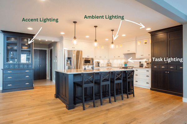
Don’t forget about dimmers. Not all LEDs dim well, especially high-CRI ones. Check if your bulbs are dimmable and compatible with your existing switches. If you notice flickering or buzzing, it might be time to upgrade the dimmer switch too. Finally, consider the beam angle. Spotlights need high CRI to highlight art or textures, while ambient lights need it to wash the room in natural color. Thoughtful placement maximizes the impact of your new bulbs. It’s not just about swapping hardware; it’s about curating light.
The shift away from CRI 80 isn’t just a technical update; it’s a cultural one. We’re realizing that our environments shape our experiences. In 2026, we have the technology to make our homes look and feel better. There’s no reason to settle for "good enough" when "great" is accessible and affordable. By choosing higher CRI or TM-30 rated lighting, you’re investing in a home that honors the true colors of your life. It’s a small change with a big payoff. So go ahead, swap out that old bulb. Your eyes—and your home—will thank you.
[sps_html tag=”img” src=”https://cdn.northcarolinafinearchitecture.com/2026/06/risk-perception-meaning-examples-types-factors-importance-regarding-the-hidden-truth-about-cri-scores-and-human-perception.png” alt=”Risk Perception - Meaning, Examples, Types, Factors, Importance regarding The Hidden Truth About CRI Scores and Human Perception” style=”width: 100%; height: auto;”]
[sps_html tag=”img” src=”https://cdn.northcarolinafinearchitecture.com/2026/06/what-is-color-rendering-index-cri-olamled-in-the-hidden-truth-about-cri-scores-and-human-perception.png” alt=”What Is Color Rendering Index (Cri)? - Olamled in The Hidden Truth About CRI Scores and Human Perception” style=”width: 100%; height: auto;”]
[sps_html tag=”img” src=”https://cdn.northcarolinafinearchitecture.com/2026/06/unravelling-the-mystery-what-does-cri-score-mean-led-supply-fit-in-cri-rating-design.jpg” alt=”Unravelling The Mystery: What Does Cri Score Mean? | Led Supply & Fit in Cri Rating Design” style=”width: 100%; height: auto;”]
[sps_html tag=”img” src=”https://cdn.northcarolinafinearchitecture.com/2026/06/hidden-risk-in-classic-info-risk-scores-matrices-ostrich-cyber-risk-with-regard-to-cri-rating-design.jpg” alt=”Hidden Risk In Classic Info Risk Scores & Matrices — Ostrich Cyber-Risk with regard to Cri Rating Design” style=”width: 100%; height: auto;”]