Ever stepped onto a patio and felt an instant wave of calm? Or maybe you walked out and felt energized, ready to tackle the day? That’s not magic. It’s color. We often treat our outdoor spaces like afterthoughts, slapping together whatever furniture was on sale or matched the house siding. But here’s the thing: your patio is an extension of your living room. It deserves the same thought, care, and intentionality. And the fastest way to change the vibe without knocking down walls? Swapping out the hues of your seating.
In 2026, the approach to outdoor design has shifted. It’s no longer just about durability or weather resistance—though those still matter. It’s about emotional resonance. Designers are leaning hard into palettes that reflect our desire for connection with nature, but also our need for personal expression. Whether you have a tiny balcony in the city or a sprawling deck in the suburbs, the colors you choose for your chairs, sofas, and cushions dictate how you feel when you sit down. Let’s dive into how you can use color not just to decorate, but to transform.
Understanding the Psychology of Outdoor Hues
Color isn’t just visual; it’s visceral. When you pick a shade for your outdoor sectional, you’re picking a mood. Warm tones like terracotta, burnt orange, and soft yellows invite conversation. They mimic the glow of sunset and firelight, making people lean in and talk louder. Cool tones like slate blue, sage green, and crisp white do the opposite. They create space. They encourage relaxation, deep breaths, and quiet contemplation. If your patio is a place for morning coffee and reading, you probably want cool. If it’s for weekend barbecues and loud laughs, go warm.
But it’s not just about hot vs. cold. It’s about weight. Dark colors feel grounded and serious. A charcoal gray sofa feels substantial, almost architectural. Light colors feel airy and ephemeral. A cream-colored lounge chair seems to float. This matters because patios are often small. If you have a cramped space, heavy dark furniture can make it feel like a cave. Light, reflective colors bounce light around and make the area feel twice as big. Conversely, if you have a huge, empty deck, dark anchors can make it feel cozy instead of cavernous.
Think about what you actually do out there. Do you work from your patio? Blue tones boost focus. Do you entertain? Reds and oranges stimulate appetite and energy. Do you nap? Greens and neutrals lower heart rates. Stop thinking about what looks good in a catalog and start thinking about how you want to feel when your butt hits the cushion. That’s the secret most people miss. They buy for the eye, not the body.
The 2026 Palette Trends: Earthy, Bold, and Soft
So, what’s happening right now in the world of outdoor design? If you look at the top trends for 2026, you’ll see a clear split. On one side, there’s a massive move toward earthy, organic tones. Think clay, moss, sand, and stone. These aren’t just beige; they’re complex, textured neutrals that blend seamlessly with plants and soil. They make your patio feel like it grew out of the ground rather than being dropped onto it. This is huge for people who want their outdoor space to feel like a true retreat from the digital world.
On the other side, we’re seeing bold contrasts. Designers are pairing deep navy with bright citrus yellow, or black metal frames with vibrant magenta cushions. It’s playful. It’s confident. It says, “I’m here to have fun.” This trend is particularly popular in urban settings where the backdrop is concrete and glass. You need that pop of color to break up the monotony. Then there’s the third player: soft modern pastels. Not the baby shades of the 90s, but muted, dusty versions of lavender, peach, and mint. They’re sophisticated and calming, offering a middle ground between the earthy and the bold.
The key to nailing these 2026 trends is context. An earthy palette works best if you have lots of greenery. The plants provide the life; the furniture provides the frame. Bold contrasts work best in minimalist spaces where the furniture is the star. Soft pastels shine in spaces with lots of natural light, where they can glow without looking washed out. Don’t just copy a Pinterest board. Look at your light, your plants, and your architecture. Which trend complements what you already have? That’s the one to pick.
Mixing Materials and Textures for Depth
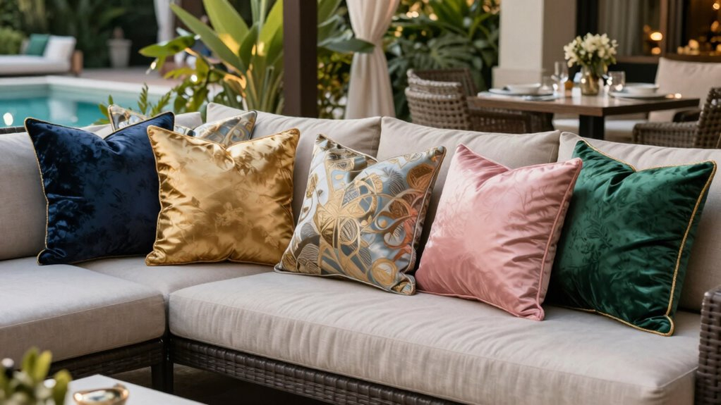
Color doesn’t exist in a vacuum. It lives on materials. And materials have texture. A bright red plastic chair feels very different from a bright red velvet cushion, even if the hue is identical. In 2026, the smartest designers are mixing materials to add depth to their color schemes. Think teak wood with linen cushions. Wrought iron with leather straps. Rattan with cotton blends. Each material absorbs and reflects light differently, which changes how the color reads throughout the day.
For example, natural wood tones warm up any color palette. If you have cool gray cushions, adding a teak table instantly makes the scheme feel more inviting and less sterile. Metal frames, especially in black or bronze, add definition. They outline the color, making it pop. Fabric textures matter too. A smooth synthetic fabric might look cheap in bright colors, but a textured weave in the same color looks luxurious and intentional. Always touch the fabric. Does it look flat? Or does it have variation? Variation hides dirt and adds interest.
Don’t be afraid to mix finishes within the same color family. You can have a matte black chair next to a glossy black table. The difference in sheen creates a subtle contrast that keeps the eye moving. This is especially important if you’re sticking to a neutral palette. Without texture and finish variation, neutrals can look boring and flat. Layering a rough jute rug under smooth ceramic pots and soft woven cushions creates a tactile experience that feels rich and curated. It’s not just about what you see; it’s about what you feel.
Balancing Neutrals with Pops of Accent Colors
Here’s a rule of thumb that never fails: start with a neutral base, then add accents. It’s safer, it’s easier, and it’s more flexible. Your largest pieces—the sofa, the dining table, the umbrella—should be in neutral tones like white, beige, gray, or brown. These are your anchors. They don’t shout. They let the other elements sing. Then, use smaller items like throw pillows, side tables, planters, and rugs to introduce your accent colors. This way, if you get bored of bright yellow, you just swap the pillows, not the whole sofa.
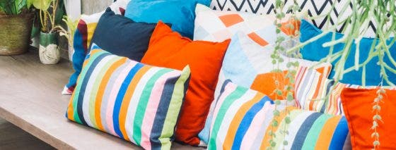
The ratio matters. A good starting point is the 60-30-10 rule. Sixty percent of your space should be your primary neutral. Thirty percent should be a secondary color (maybe a softer neutral or a muted tone). Ten percent should be your bold accent. So, if your patio is mostly beige (60%), with some light gray cushions (30%), you can add ten percent of vibrant teal through pillows and a vase. It’s enough to catch the eye without overwhelming the senses. Too much accent color creates visual noise. Too little feels timid.
When choosing accents, look to nature for inspiration. If you have purple lavender growing in your garden, pull that purple into your cushions. If you have a copper fire pit, use rust-orange accents. This creates harmony between your built environment and your natural surroundings. It makes the patio feel cohesive rather than disjointed. Also, consider the season. You might want brighter accents in summer and warmer, deeper accents in fall. Having a few sets of interchangeable covers allows you to shift the mood with the weather, keeping the space feeling fresh year-round.
Lighting and Its Impact on Color Perception
We often forget that color changes depending on the light. The blue cushion that looks crisp and clean at noon might look muddy and dark at dusk. The white table that glows in the morning sun might look stark and clinical under harsh midday rays. Understanding how light interacts with your color choices is crucial for a patio that looks good all day long. Natural light is dynamic. It shifts in temperature and intensity from sunrise to sunset. You need to test your colors in different lighting conditions before committing.
Artificial lighting plays an even bigger role in the evening. Warm white bulbs (around 2700K) will enhance reds, oranges, and yellows, making them feel cozier. Cool white bulbs (4000K+) will enhance blues and greens, making them feel crisper but potentially colder. If you’re using string lights or lanterns, pay attention to their color temperature. A warm glow on cool blue furniture can create a strange, slightly off vibe. Match your lighting to your palette. If you have a warm, earthy scheme, stick to warm lighting. If you have a modern, cool scheme, cooler lighting might work better.
Shade is another factor. If your patio is mostly shaded, dark colors will disappear into the shadows. You’ll need lighter, brighter colors to keep the space feeling open and airy. If your patio is in full sun, dark colors can absorb heat and become uncomfortable to touch. Light colors reflect heat and stay cooler. But be careful: pure white in direct sun can be blinding. Off-whites or creams are often a better choice for sunny spots. They offer the brightness without the glare. Always consider the practical comfort of the color, not just the aesthetic.
Let’s get real for a second. Outdoor furniture takes a beating. Sun, rain, wind, bird droppings, spilled wine—it all adds up. So, when you’re picking colors, think about maintenance. Light colors show dirt. Dark colors fade. There’s no perfect option, but there are smarter choices. Solution-dyed acrylic fabrics are the gold standard for 2026. The color is baked into the fiber, so it resists fading and staining much better than traditional dyed fabrics. They cost more upfront, but they last longer and look better over time.
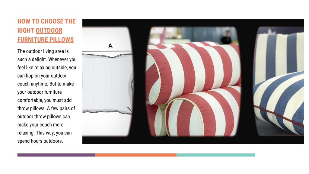
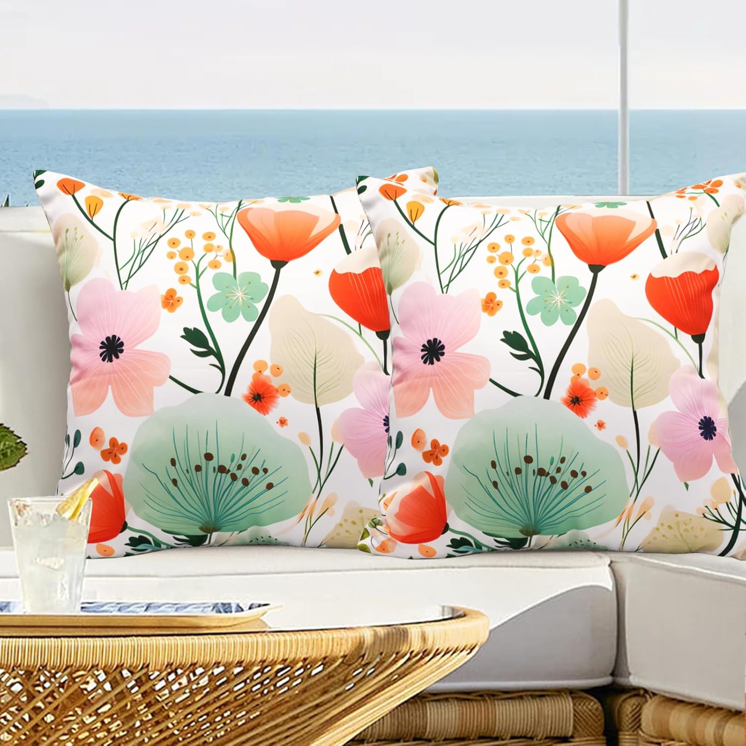
If you’re worried about fading, choose patterns. Solids show every bit of wear and tear. Patterns, especially multi-colored ones, hide stains and fading remarkably well. A busy floral or geometric print can look fresh for years even as the colors subtly shift. Also, consider removable covers. Being able to toss your cushions in the wash once a season makes a huge difference in how long they look new. If you can’t wash them, at least choose fabrics that can be hosed down.
Finally, don’t forget the power of accessories. You don’t have to repaint your whole set to change the look. Swap out the cushions. Add a new rug. Paint a side table. Hang some colorful wind chimes. These small changes are low-commitment and high-impact. They allow you to experiment with color without breaking the bank. Start small. See what works. Adjust as you go. Your patio is a living space, literally and figuratively. It should evolve with you. So, take a breath, pick a color that makes you smile, and start transforming.
Choosing the right color scheme for your patio seating isn’t just about aesthetics. It’s about creating a space that supports your lifestyle, enhances your mood, and connects you with the outdoors. By understanding the psychology of color, staying aware of current trends, mixing textures, balancing neutrals with accents, considering lighting, and planning for maintenance, you can create a patio that feels truly yours. It doesn’t have to be perfect. It just has to feel right. So go ahead. Pick that bold yellow. Try that soothing green. Your outdoor sanctuary is waiting.
[sps_html tag=”img” src=”https://cdn.northcarolinafinearchitecture.com/2026/05/amazon-com-virexen-floral-outdoor-throw-pillow-covers-18×18-waterproof-intended-for-how-to-choose-outdoor-pillows-that-actually-survive-the-2026-summer.jpg” alt=”Amazon.com: Virexen Floral Outdoor Throw Pillow Covers 18X18 Waterproof … intended for How to Choose Outdoor Pillows That Actually Survive the 2026 Summer” style=”width: 100%; height: auto;”]
[sps_html tag=”img” src=”https://cdn.northcarolinafinearchitecture.com/2026/05/how-to-choose-the-right-outdoor-pillows-covers-all-inside-how-to-choose-outdoor-pillows-that-actually-survive-the-2026-summer.jpg” alt=”How To Choose The Right Outdoor Pillows | Covers & All inside How to Choose Outdoor Pillows That Actually Survive the 2026 Summer” style=”width: 100%; height: auto;”]
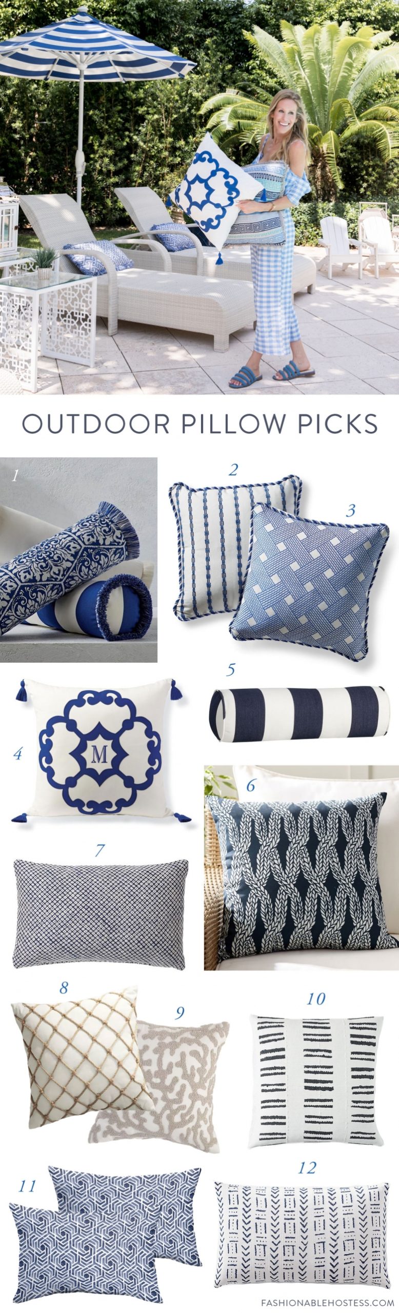
[sps_html tag=”img” src=”https://cdn.northcarolinafinearchitecture.com/2026/05/outdoor-pillows-you-need-this-summer-fashionable-hostess-throughout-how-to-choose-outdoor-pillows-that-actually-survive-the-2026-summer-scaled.jpg” alt=”Outdoor Pillows You Need This Summer - Fashionable Hostess throughout How to Choose Outdoor Pillows That Actually Survive the 2026 Summer” style=”width: 100%; height: auto;”]
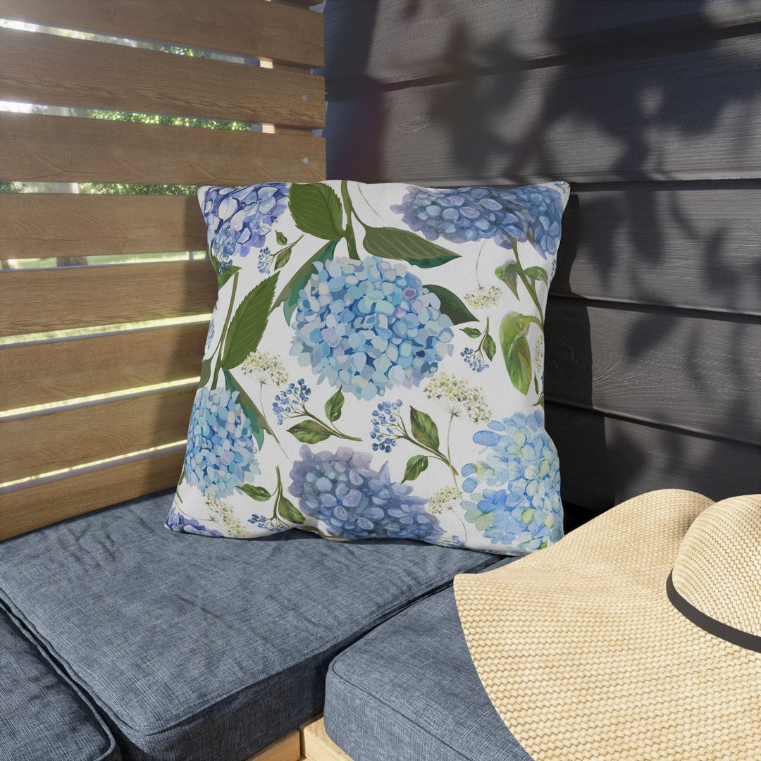
[sps_html tag=”img” src=”https://cdn.northcarolinafinearchitecture.com/2026/05/outdoor-pillows-summer-outdoor-pillow-hydrangea-pillow-outdoor-intended-for-outdoor-pillow-design.jpg” alt=”Outdoor Pillows, Summer Outdoor Pillow, Hydrangea Pillow Outdoor … intended for Outdoor Pillow Design” style=”width: 100%; height: auto;”]
[sps_html tag=”img” src=”https://cdn.northcarolinafinearchitecture.com/2026/05/ppt-shop-outdoor-furniture-pillows-at-the-cushion-company-powerpoint-with-outdoor-pillow-design.jpg” alt=”Ppt - Shop Outdoor Furniture Pillows At The Cushion Company Powerpoint … with Outdoor Pillow Design” style=”width: 100%; height: auto;”]