Stand on any residential sidewalk, look up at the homes lining the street, and try not to form an opinion. You cannot do it. Long before a guest steps onto your porch or knocks on your front door, your house is already speaking for you. It whispers secrets about your tolerance for chaos, your appreciation for history, your financial mindset, and your desire to blend in or stand out.
Consider the stark white colonial sitting proudly behind manicured boxwoods. It projects order, tradition, and an uncompromising standard of cleanliness. Contrast that with the low-slung mid-century ranch painted in a rich, saturated avocado green, half-hidden by Japanese maples. That home tells a completely different story—one of artistic eccentricity, comfort with nature, and a quiet rejection of suburban uniformity. Your exterior paint color is the ultimate silent ambassador.
Yet, staring down a wall of paint chips at the local hardware store is enough to induce vertigo. The sheer volume of choices—ranging from stark alabasters to moody charcoals and earthy terracottas—turns what should be an exciting creative endeavor into an exercise in high-stakes paralysis. Get it wrong, and you are stuck living with a visual eyesore that lowers your property value and fills you with regret every time you pull into the driveway. Get it right, and your home transforms into a masterclass in curb appeal that feels undeniably, authentically you.
The Psychological Blueprint of Exterior House Colors
Color psychology is not just for branding agencies and interior designers; it plays a profound role in how the outside world perceives your sanctuary. When you select a hue for your siding, trim, and front door, you are broadcasting a psychological profile to postal workers, neighbors, and potential buyers. Every shade carries historical baggage, emotional resonance, and cultural connotations that color our immediate reactions.
Light neutrals—such as crisp whites, warm ivories, and soft creams—signal cleanliness, simplicity, and a reverence for architectural lines. Homeowners who gravitate toward these shades often value order, minimalism, and timelessness. They want their home to act as a serene, unpretentious backdrop to life. However, these choices also require maintenance; a brilliant white house demands vigilance against dirt, mildew, and weathering, subtly communicating that the homeowner takes pride in meticulous upkeep.
On the opposite end of the spectrum, deep and moody exteriors—think charcoal gray, rich espresso brown, and midnight navy—have surged in popularity. Choosing a dark exterior color reveals a bold, confident personality. It tells the neighborhood that you are not afraid to break convention, embrace drama, and lean into modern sophistication. Dark homes absorb light and project weight, creating a grounded, protective aura that feels both intimate and formidable.
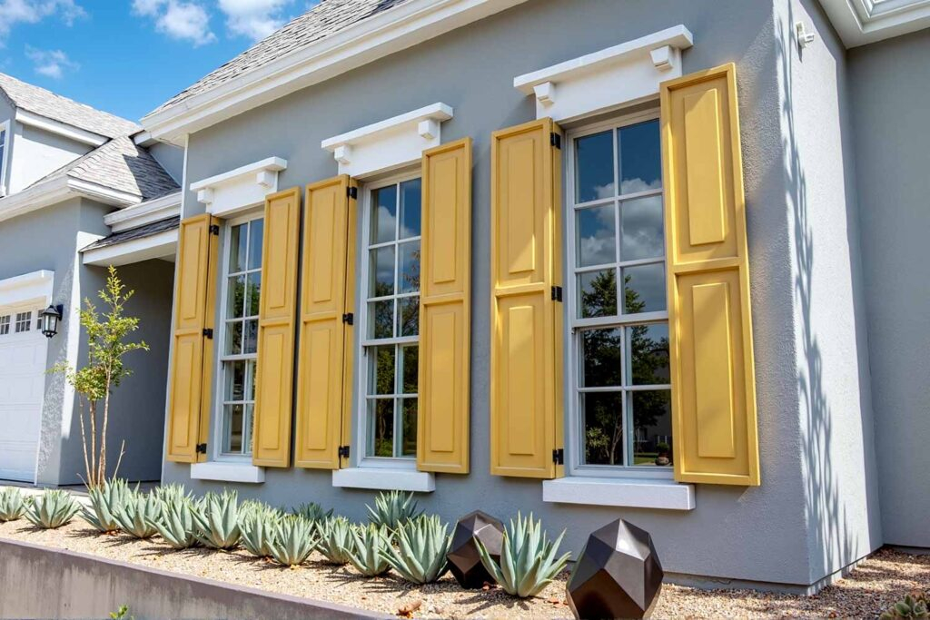
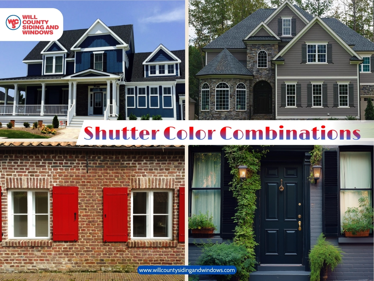
Earthy tones like olive greens, warm taupes, and muted clays tell a story of grounding, stability, and a deep connection to the natural world. People who choose these colors typically prioritize comfort, organic textures, and blending harmoniously with their environment rather than competing with it. Meanwhile, vibrant pops of color on a front door—a bright yellow, a punchy coral, or a classic pillar-box red—reveal a playful, welcoming spirit. It is an open invitation, signaling to the world that behind this facade lives someone with a sense of humor and a hospitable heart.
Decoding Architectural Harmony and Historical Context
While understanding your own psychological inclinations is vital, a paint color does not exist in a vacuum. It must negotiate with the architecture of your home. Slapping a hyper-modern matte black finish onto a quaint 1920s Craftsman bungalow creates a jarring dissonance, much like wearing a tuxedo with neon running shoes. True curb appeal stems from honoring the historical and structural integrity of the building while injecting your personal flair.
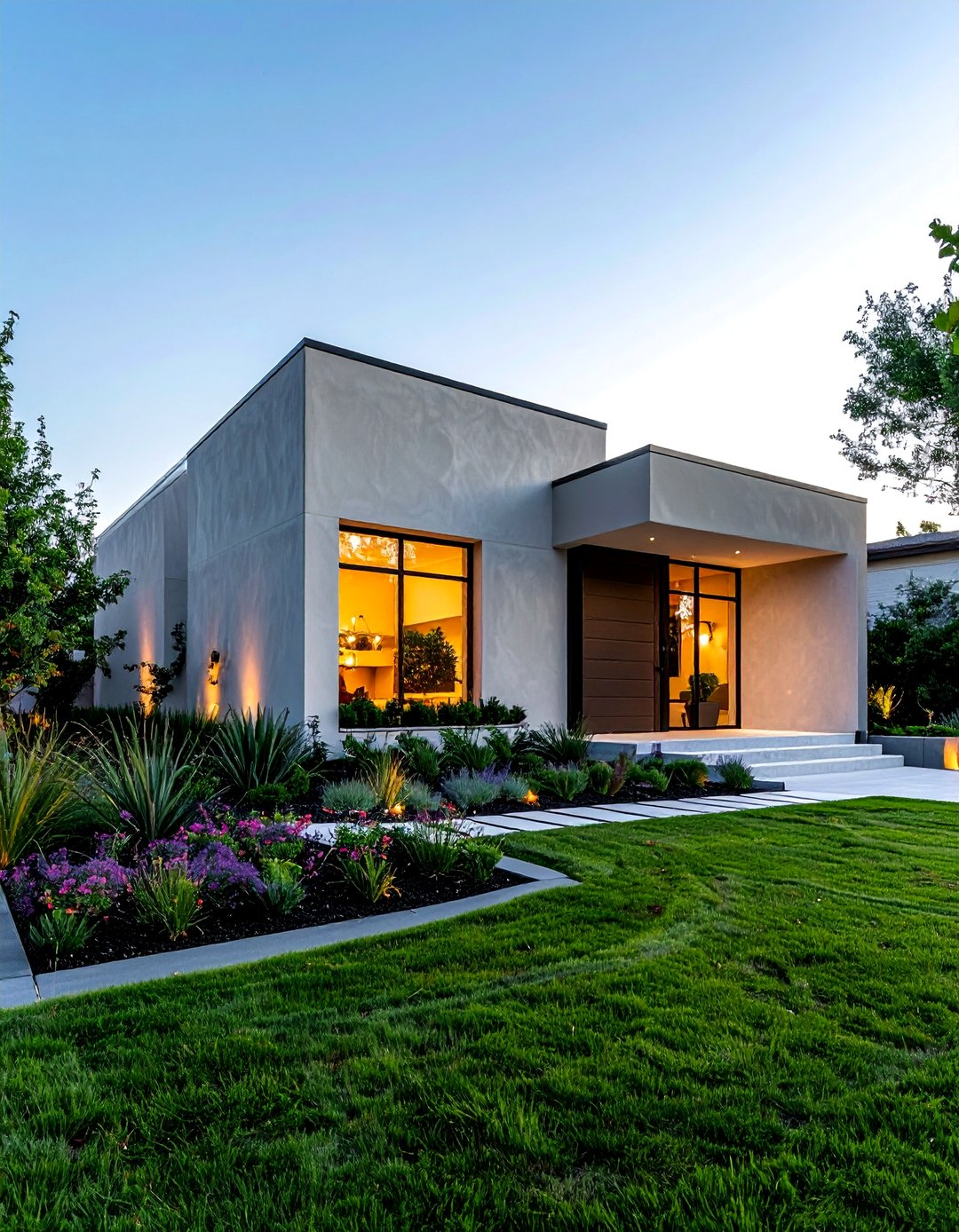
Different architectural eras came with their own established color palettes for a reason. Victorian homes demand eccentric, multi-colored schemes that highlight their intricate gingerbread trim, bay windows, and gables. Choosing three to five distinct colors for the body, trim, and accents on a Victorian home reflects an appreciation for craftsmanship, detail, and historical narrative. Conversely, modern and contemporary homes thrive on restraint. Monochromatic palettes, sleek lines, and high-contrast combinations of wood, glass, and neutral stucco allow the geometric forms of the structure to speak for themselves.
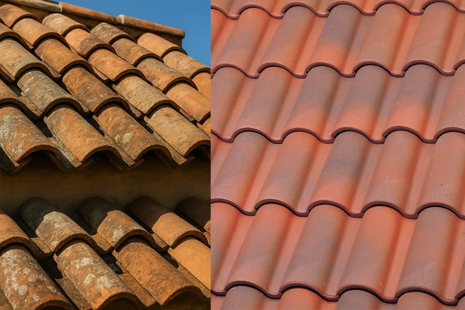
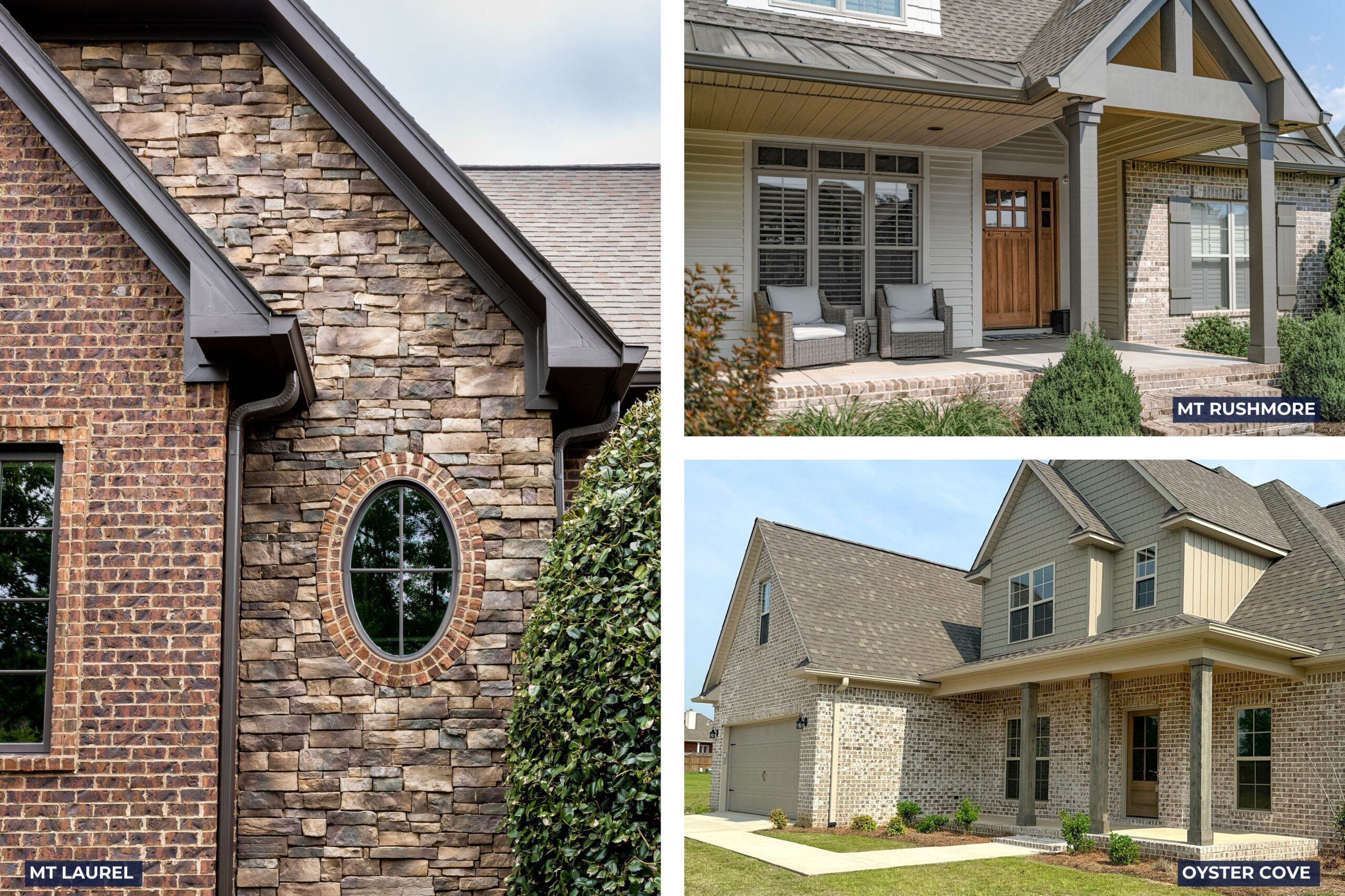
Roof color is another permanent fixture that many homeowners overlook until it is too late. Your shingles or tiles act as a massive color block that your siding must converse with. A cool gray roof will clash horribly with a warm, buttery yellow siding unless managed with careful undertone selection. Understanding whether your roof leans warm (red, brown, orange undertones) or cool (blue, gray, charcoal undertones) is the secret weapon of professional colorists.
Furthermore, neighborhood context matters deeply. You do not need to bow to rigid homeowners association (HOA) regulations if you despise them, but ignoring the vernacular of your surroundings can backfire. A neon pink house in a sea of beige colonials will certainly make a statement, but it may alienate your neighbors and negatively impact your resale value. Striking the balance between personal expression and contextual harmony is where the magic happens.
A Step-by-Step Methodology for Selecting Your Perfect Palette
Navigating the vast ocean of paint options requires a disciplined, step-by-step framework. Skipping these phases often leads to costly mistakes and weekend-ruining do-overs. Professional exterior designers rely on a structured methodology to take the guesswork out of the equation.
- Step 1 (Audit Fixed Elements): Catalog all the exterior features of your home that you cannot or will not change, including the roof shingles, brick or stone masonry, concrete pathways, and surrounding natural foliage. Your new paint color must harmonize with these existing elements.
- Step 2 (Determine the Architectural Style): Research the historical or structural origins of your home. Identify traditional color combinations associated with your specific style to serve as an authentic baseline before you start experimenting.
- Step 3 (Select a Three-Part Palette): Build a cohesive color scheme consisting of a primary body color for the main siding, a secondary trim color for fascia, soffits, and window frames, and an accent color reserved exclusively for the front door and perhaps porch ceilings.
- Step 4 (Test Large Swatches On-Site): Never judge an exterior color by a tiny paper paint chip. Purchase sample pots and paint at least two-foot-by-two-foot squares directly onto different sides of your house, observing how the light shifts from morning harshness to evening golden hour.
- Step 5 (Evaluate Sheen and Durability): Choose the appropriate paint finish for your siding material—typically low-lustre or satin for siding to hide minor imperfections, and semi-gloss for trim and front doors where durability and easy cleaning are paramount.
Common Pitfalls and Field-Tested Workarounds
Even the most enthusiastic DIYers or design novices can stumble into classic traps when painting a house exterior. Recognizing these hazards before you dip a brush into a bucket will save you time, money, and frustration.
- Pitfall 1 (Ignoring the Power of Natural Sunlight): Paint colors look dramatically different outdoors than they do under the artificial fluorescent lights of a hardware store. Workaround: Always evaluate your painted test boards across multiple days in direct sun, deep shadow, and overcast weather to see how the undertones behave.
- Pitfall 2 (Choosing Colors Based on Online Photos Alone): Digital screens distort color calibration, and heavily edited Instagram photos rarely reflect reality. Workaround: Use digital visualizer tools offered by major paint manufacturers to preview shades, but always rely on physical sample boards on your actual walls as the final authority.
- Pitfall 3 (Overcomplicating the Palette): Using four or five different body and trim colors creates visual clutter and makes a home look chaotic rather than thoughtfully designed. Workaround: Stick to the classic rule of three: a main body color, a complementary trim color, and a statement accent color.
- Pitfall 4 (Neglecting the Front Door as a Focal Point): Painting the front door the exact same color as the rest of the house causes it to disappear into the facade. Workaround: Treat the front door as a piece of functional art; use a bold, contrasting color or a rich gloss finish to draw the eye inward.
- Pitfall 5 (Skimping on Paint Quality and Prep): Exterior paint takes a brutal beating from UV rays, rain, freeze-thaw cycles, and wind. Buying cheap paint or skipping power washing and priming guarantees premature peeling. Workaround: Invest in 100% acrylic latex exterior paint with high pigment loads and spend 80% of your time on surface preparation.
The Economic and Environmental Impact of Exterior Color
Choosing an exterior paint color is not merely an aesthetic choice; it carries tangible financial and ecological consequences. According to real estate valuation studies, a fresh, professionally executed exterior paint job can boost home value and curb appeal by up to 15 percent. When potential buyers pull up to a freshly painted home, their subconscious mind registers that the property has been cherished, maintained, and protected from the elements.
On an environmental level, your choice of color impacts your home’s thermal performance. Dark colors absorb a significant amount of solar radiation, converting light into heat. While this can be a blessing during freezing winters in northern climates, it can turn an unshaded southern-exposure house into an oven during scorching summer months, driving up air conditioning costs. Conversely, highly reflective light colors bounce solar heat away from the building, keeping interiors cooler.
Modern paint technology has also evolved to address these concerns. High-performance exterior paints now feature infrared-reflective pigments, allowing homeowners to select deeper, moodier shades like forest green or navy blue without absorbing excessive solar heat. When selecting your paint, inquire about advanced formulations that resist fading, inhibit mildew growth without toxic runoff, and offer superior elastomeric properties to bridge hairline cracks in stucco or masonry.
Strategic Frameworks for Long-Term Curb Appeal
Achieving long-lasting curb appeal requires thinking beyond the immediate gratification of a freshly painted wall. It demands a holistic approach that integrates lighting, hardware, landscaping, and maintenance schedules into your overall design philosophy.
Lighting acts as the night-time extension of your paint color. Warm LED exterior sconces will enhance earthy tones and reds, while cooler, crisp light fixtures will accentuate modern grays, blues, and whites. Upgrading your house numbers, door hardware, and mailbox to match the metal finishes of your light fixtures creates a cohesive, high-end look that elevates the entire exterior presentation.
Landscaping serves as the living frame for your painted canvas. If your house is painted a cool sage green, surrounding it with warm yellow and purple perennial flowers creates a stunning, complementary color contrast. If your home features a dark charcoal exterior, vibrant green foliage and white flowering shrubs will pop against the dark backdrop, creating dramatic depth and architectural contrast.
Finally, establish a proactive maintenance routine. Exterior paint is your home’s first line of defense against moisture intrusion, wood rot, and insect damage. Inspect your painted surfaces annually for chalking, bubbling, or cracking, particularly on southern-facing exposures that receive the most intense UV degradation. Power washing your home once a year removes accumulated atmospheric pollutants and pollen, keeping your chosen color vibrant and true for years to come.
Your house exterior paint color is a quiet autobiography written in pigments and resins. It reflects your values, honors your home’s architectural heritage, and sets a welcoming tone for everyone who passes by. Staring down those paint chips does not have to be an exercise in anxiety; it is an invitation to define your home’s character on your own terms.
Take your time with the process. Honor the physical realities of your roof, your landscaping, and your local climate. Test your samples, trust your instincts, and do not be afraid to lean into a bold choice if it resonates with your personal aesthetic. When you finally roll that last stroke of paint onto your trim and step back to admire the transformation, you will realize that a coat of paint does much more than protect wood and siding—it gives your home a soul.