When you walk into a crowded building, you probably don’t think twice about the exit signs. They are just there, glowing in the background, quietly waiting for an emergency. But have you ever paused to consider who those signs are actually built for? If a crisis hits and the room fills with smoke, or if panic sets in, can everyone in that space actually find their way out safely.
For decades, emergency wayfinding was treated like an afterthought—a compliance box to check with a standard red or green light. But things are shifting quickly. As we move through 2026, a massive wave of fresh accessibility guidelines is completely transforming how we think about emergency exits, making spaces safer for everyone, regardless of physical or mental ability.
The Shift From Compliance to True Inclusivity
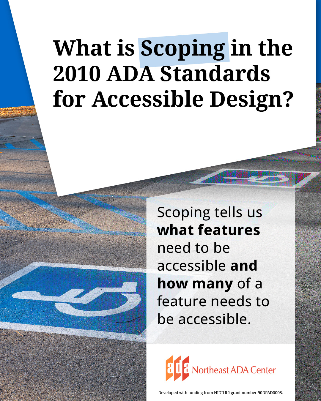
For years, building designers relied strictly on the older 2010 ADA Standards for Accessible Design. While those guidelines laid a crucial foundation, they often treated accessibility as a physical checklist—like adding a ramp or making a door wider. Today, the conversation has expanded. Modern standards focus heavily on universal design, which means creating spaces that are inherently usable by all people without needing special adaptation.
Recent updates to the rules underscore that safety shouldn’t be a privilege. It is a fundamental legal obligation and a cornerstone of human-centered architecture. Designers are no longer just asking, "Is this sign code-compliant?" Instead, they are asking, "Can a person experiencing extreme stress or a sensory disability read this in five seconds?" This shift is fundamentally altering the visual landscape of our public buildings.
Seeing and Feeling the Way Out
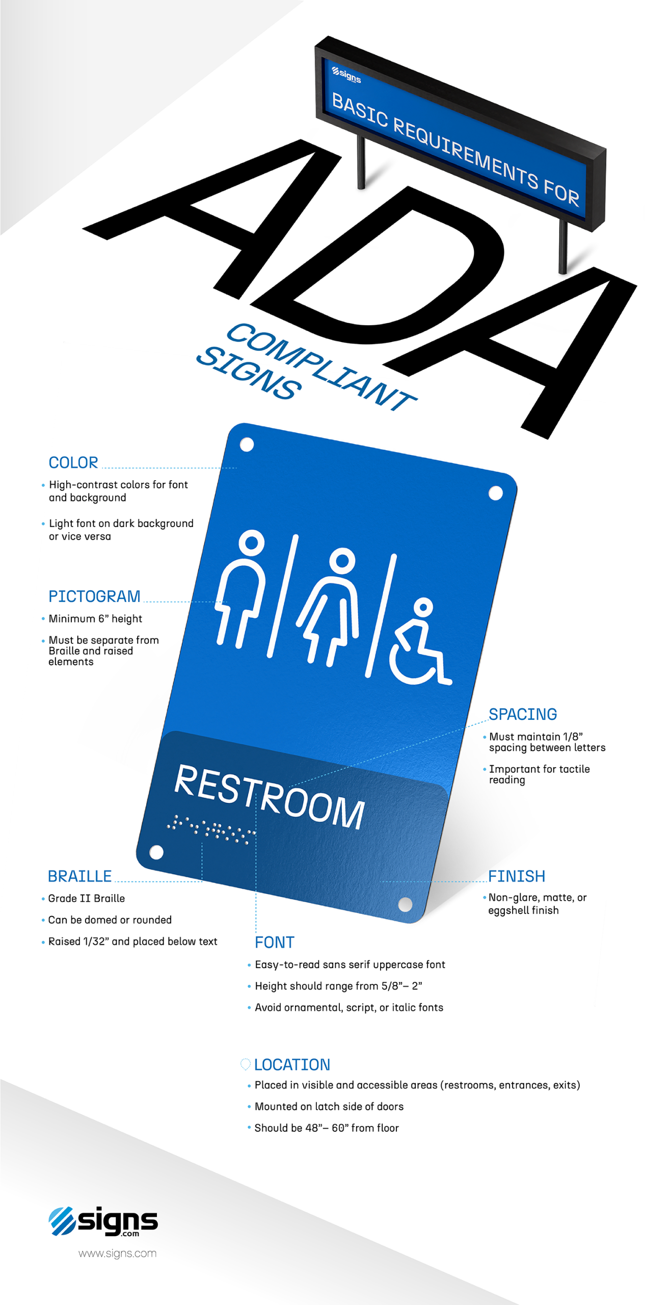
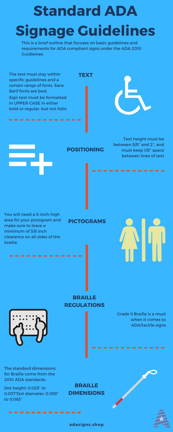
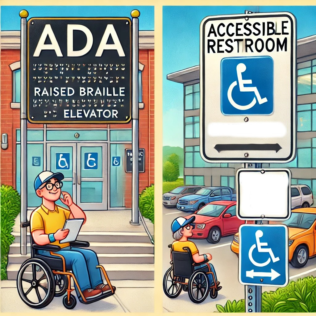
When it comes to escaping a dangerous situation, relying on sight alone isn’t enough. What happens if you have low vision, or if a fire knocks out the power and fills the hallway with thick, dark smoke? That is where tactile signage comes into play. Modern regulations require critical exit markers to feature raised lettering and high-quality Braille so people can literally feel their way to safety.
Furthermore, the physical placement of these signs is changing. You can’t reach a sign that is hanging ten feet above a doorway if you need to feel the raised letters. Because of this, facilities are installing companion signs at eye level on the wall next to the exit doors. These tactile markers give clear indicators of where a route leads, ensuring nobody is left guessing when every second counts.
High Contrast and the Battle Against Smoke
Have you ever tried reading a poorly lit sign through a haze? It is nearly impossible. To combat this, modern standards place a massive emphasis on visual contrast. The background and the text on an emergency sign must have a stark, measurable difference in brightness. This ensures that the message pops, even when a person’s vision is blurred by adrenaline or environmental factors.
Lighting technology has also taken a giant leap forward. We are seeing a move toward smart, self-luminous, and highly efficient LED exit systems. These signs don’t just stay lit; they maintain a consistent, glare-free brightness that cuts through darkness and smoke without blinding the person looking at it.
Embracing Neurodiversity in Emergency Design
Perhaps the most exciting shift in recent times is the expanded focus on neurodiversity. Traditional exit signage, with its flashing lights and piercing alarms, can cause severe sensory overload. For individuals with autism, ADHD, PTSD, or dyslexia, a chaotic environment makes processing information even harder.
To help with this, forward-thinking compliance guidelines now cover calming colors, simple layouts, and easy-to-read text. By removing unnecessary visual clutter and using predictable, straightforward language, these new designs allow people with sensory issues to feel more at ease and find their way faster during a crisis. It turns out that cleaner design helps everyone think more clearly when panic sets in.
Universal Icons and the Global Language of Safety
Language barriers can be incredibly dangerous during an evacuation. If an international traveler doesn’t speak the local language, a sign that simply says "EXIT" might not register immediately. That is why modern signage is embracing universal pictograms, like the famous "Running Man" icon used globally.
These graphic symbols communicate danger and direction instantly, bypassing the need to read specific words. By blending these clear visuals with tactile English text, building managers are creating a layered system of communication. It ensures that whether you are a tourist, a child, or a resident, the path to safety is completely unmistakable.
Actionable Steps for Building Managers
If you manage a facility or are planning a renovation, keeping up with these changes is vital to avoid hefty fines and keep people safe. First, conduct a thorough walkthrough to check that all permanent exit routes have matching tactile and Braille signs installed at the correct legal height. Don’t just look up; make sure your signs are reachable.
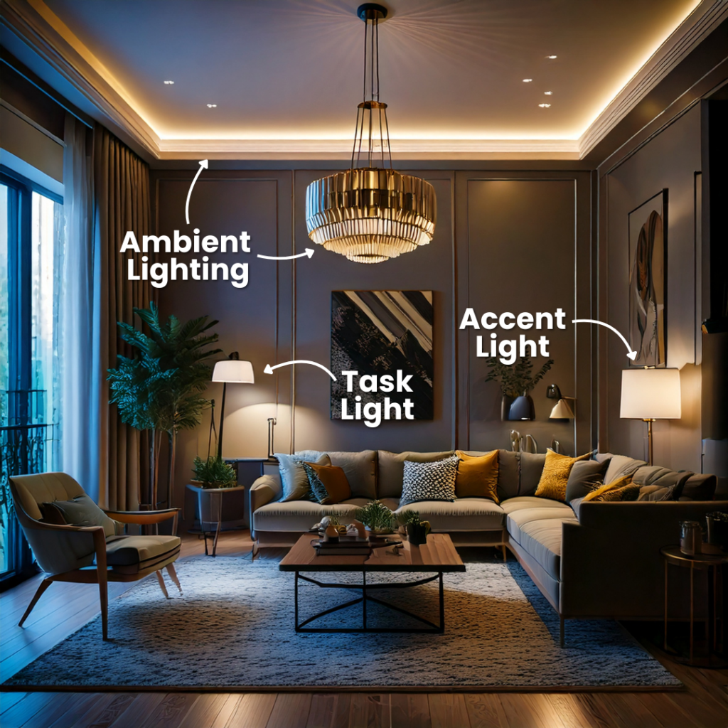
Second, audit your color choices and lighting. Replace any dim or flickering bulbs immediately with high-contrast, neurodiverse-friendly fixtures. Finally, collaborate with accessibility experts early in your design process. Making wayfinding inclusive from the ground up is always cheaper and more effective than trying to patch a flawed system later.
Ultimately, the evolution of exit signage is about much more than just following the law or memorizing government handbooks. It is about empathy. It’s a recognition that our public spaces must protect and welcome every single person who steps inside them, no matter how they move, see, or process information.
By embracing these modern, inclusive design standards, we are building a world where emergency navigation is intuitive rather than terrifying. The next time you spot a modern exit sign, take a moment to appreciate the thoughtful engineering behind it. It is not just a sign. It is a quiet promise that everyone can find their way home safely.