You walk into a paint store, armed with optimistic intentions and a vague desire for a room that feels "like a quiet morning in the forest." Twenty minutes later, you are standing under the merciless glare of fluorescent overhead bulbs, staring down a cardboard carousel of thirty-four distinct paint chips that all look aggressively identical. You grab a swatch labeled with an earthy, poetic name—something like Restful Thicket or Morning Fog—take it home, slap a two-foot square patch onto your drywall, and watch in horror as it morphs into an electric, minty neon under your east-facing morning light.
It is a rite of passage familiar to anyone who has ever tried to decorate a home. Paint is deceptively complex. It is a liquid chameleon, shifting its personality based on the time of day, the temperature of your lightbulbs, and the color of the sofa sitting right across from it. Among all the hues on the color wheel, sage green is arguably the most seductive and the most deceptive. It promises tranquility, organic warmth, and effortless sophistication. Yet, getting it right requires a firm grasp of color theory that most hardware store employees rarely have the time to explain.
Professional designers treat sage green not merely as a color, but as an atmospheric tool. Entering homes designed with this palette reveals an intentional pause from digital saturation, offering a grounded, breathable environment. But achieving that high-end, designer-finished look is not about picking the trendiest shade off a TikTok mood board. It requires understanding how light, architecture, and undertones interact.
The Anatomy of a Chameleon: Decoding Sage Green Undertones
To understand why sage green behaves so unpredictably on your walls, you have to look beneath its surface. Pure green is rare in interior architecture because it can easily feel overwhelming or clinical. True sage is a hybrid—a muted, dusty orchestration of green mixed with varying ratios of gray, blue, and yellow. This molecular makeup is precisely why sage has established itself as the premier neutral for contemporary homes, yet it is also the source of endless domestic frustration.
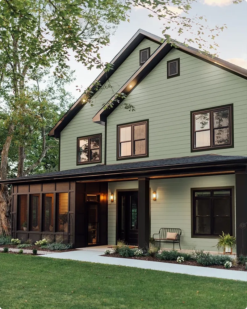
Most sage paint colors fall into three distinct undertone families. Silvery gray-greens read cool and recede, making them an exceptional choice for small powder rooms or tight corridors where you want the walls to seemingly step back. Classic, balanced sage greens sit right in the middle. They are green enough to register as an intentional color choice, yet gray enough to stay calm and unobtrusive. Then you have warm, earthy sages that lean heavily toward yellow or brown undertones, bringing an organic, sun-baked richness into spaces that lack natural sunlight.
The secret weapon that professional color consultants use to predict this behavior is Light Reflectance Value, or LRV. Ranging from 0 (absolute absorbing black) to 100 (pure reflective white), LRV tells you how much light a paint color bounces back into a room. Most desirable sage greens live in a comfortable LRV sweet spot between 35 and 55. If an LRV dips too low, your sage green wall starts reading as an moody, enveloping forest or charcoal-green cave. If it climbs too high, the paint washes out entirely under bright daylight, looking like an accidental, muddy off-white.
How Natural Light Sabotages or Elevates Your Green Walls
You can spend weeks agonizing over a paint swatch, but the color on your wall is ultimately authored by the sun. Natural daylight is not a constant, neutral white beam; its color temperature shifts dramatically throughout the day and varies wildly depending on which geographic direction your windows face. This fluid progression prevents a well-chosen sage green from ever feeling static, but it can also turn your dream room into a color-matching nightmare if you fail to account for orientation.
North-facing rooms present the trickiest challenge for sage green enthusiasts. Light entering from the north is cold, bluish, and muted. If you put a cool, gray-heavy sage in a north-facing living room, the lack of warm sunlight will drain the life out of the green, making the walls look drab, industrial, and chilly. In these spaces, designers lean toward sage paints with warm yellow or olive undertones to fight back against the blue chill.
Conversely, south-facing rooms are bathed in warm, intense golden light for the majority of the day. South-facing light amplifies warmth, meaning a warm-leaning sage can quickly look radioactive or aggressively yellow-green if you aren’t careful. Here, cooler, silvery sages find their absolute best application, as the abundant sunlight keeps them from looking depressing while preventing the room from overheating visually. East and west-facing rooms are wildcards, shifting from crisp and blue in the morning to rich, amber-drenched warmth by late afternoon, making large-scale sampling non-negotiable.
The Field-Tested Blueprint for Testing and Selecting Your Shade
Choosing the right paint is an empirical process rather than an intuitive guess. Moving from confusion to absolute clarity requires a methodical approach that eliminates variables and forces the paint to reveal its true character before you commit to gallons of product.
- Step 1 (Audit Your Room’s Light): Determine the cardinal direction of your windows and note how long the space receives direct versus indirect sunlight during peak living hours.
- Step 2 (Banish the Direct Wall Test): Never paint sample patches directly onto existing wall colors; the old paint bleeds through and tricks your eye, altering your perception of the new hue.
- Step 3 (Use Large Peel-and-Stick Swatches): Invest in large adhesive color samples (at least 12×12 inches) or paint two coats of your chosen contenders onto heavy watercolor paper, leaving a white border around the edge.
- Step 4 (Migrate the Sample Around the Room): Move your sample board across all four walls, observing how it looks in the darkest corner, directly next to trim work, and right beside your main furniture pieces.
- Step 5 (Evaluate Across a 24-Hour Cycle): Check your sample during morning coffee, high noon glare, overcast weather, and under your evening lamps to ensure you love it in every lighting condition.
Avoiding the Trapdoors: Common Mistakes and Practitioner Workarounds
Even experienced DIYers fall into predictable traps when working with muted greens. Because sage sits in that tricky middle ground between neutral and chromatic, small execution errors can throw off an entire room design. Understanding these common pitfalls before picking up a roller will save you from expensive repainting projects.
- Pitfall 1 (Ignoring Existing Hardwoods and Trim): Pairing a cool, gray-based sage with honey-oak floors or warm cream trim creates an instant visual clash due to undertone warfare. Workaround: Match your sage’s temperature to your permanent fixtures; warm wood tones demand an olive-kissed or earthy sage, while crisp white trim loves a crisp, silvery sage.
- Pitfall 2 (Choosing a Color Too Dark for Small Spaces): Falling in love with a moody, high-end design magazine photo of a deeply saturated sage and applying it to a windowless hallway makes the space feel claustrophobic. Workaround: Scale your LRV up by 10 to 15 points for smaller rooms to maintain openness and airiness.
- Pitfall 3 (Skipping the Ceiling Consideration): Leaving ceilings stark, builder-grade bright white while using a rich, enveloping sage on the walls creates an abrupt, harsh visual ceiling line. Workaround: Consider tinted ceilings or color-drenching the entire space to make the room feel taller and more cohesive.
- Pitfall 4 (Relying Solely on Digital Color Swatches): Choosing paint based strictly on a smartphone screen or a tiny paper chip guarantees disappointment due to RGB versus pigment discrepancies. Workaround: Always view physical paint swatches in natural daylight before purchasing liquid product.
- Pitfall 5 (Neglecting Artificial Lighting Temperature): Installing cool 5000K LED bulbs in a sage green kitchen drains the warmth right out of the cabinets, making them look clinical and institutional. Workaround: Switch to warm white bulbs between 2700K and 3000K to flatter the natural pigments in your paint.
The Philosophy of Permanence: Why Sage is the Ultimate Architectural Anchor
Interior design trends come and go with dizzying speed, driven by digital platforms that demand constant novelty. Yet sage green has stubbornly endured as a design staple, bridging the gap between temporary trends and timeless architecture. This durability stems from biophilic design principles—our innate evolutionary desire to connect with the natural world within our built environments. When you bring sage green into a house, you are not simply applying a color; you are mimicking the calming hues found in foliage, moss, and stone.
This organic neutrality makes sage an extraordinary backbone for long-term home investment. Unlike bright jewel tones or high-contrast modern palettes that demand frequent updates to stay relevant, sage functions as a quiet backdrop that flexes alongside your evolving furniture, art collections, and textile choices. It pairs effortlessly with raw terracotta, patinated brass, rich walnut, boucle creams, and crisp linens.
Furthermore, the psychological impact of this hue cannot be overstated. In an era dominated by hyper-connectivity and endless screen time, our homes are increasingly required to function as sanctuaries. Sage green lowers cortisol levels simply by being present. It acts as an intentional pause button for the nervous system, turning a chaotic entryway or a high-stress home office into a zone of quiet confidence and emotional restoration.
Actionable Takeaways for Your Next Painting Project
Translating inspiration into execution requires a structured framework. When you are finally ready to select your can of paint and prep your brushes, keep these core principles at the forefront of your decision-making process.
First, prioritize finish over pigment when considering room function. High-traffic hallways, kitchens, and children’s rooms demand a washable satin or eggshell sheen that resists scuffs while diffusing light softly. Conversely, imperfect plaster walls in a low-traffic bedroom benefit greatly from a chalky matte or dead-flat finish that absorbs light and hides surface blemishes, though it sacrifices cleanability.
Second, test cross-brand equivalents carefully if you are mixing paint lines. While paint color matching technology has advanced significantly, exact formulas vary between manufacturers like Sherwin-Williams, Benjamin Moore, and Farrow & Ball. A custom color match across brands can shift undertones subtly, so always test the exact brand and formula you intend to put on your walls.
Finally, build your color palette outward from the paint, not the other way around. Select your sage green first, establish its exact undertone family, and then source your rugs, art, and upholstery to complement that baseline. By letting the paint anchor the space, you ensure that every subsequent layer of your home decor feels intentional, harmonious, and deeply personal.
Choosing the perfect sage green paint for your house is ultimately an exercise in listening—to your architecture, to the shifting path of the sun across your floors, and to how you want to feel when you finally close your front door at the end of a long day. It is an invitation to slow down, bypass the rushed impulse of micro-trends, and invest in a space that honors your need for sanctuary.
Armed with an understanding of undertones, LRV metrics, and lighting dynamics, you are no longer at the mercy of the hardware store color wall. You possess the analytical tools and the designer mindset needed to transform your walls from flat planes of color into living, breathing backdrops. Take your sample boards home, watch how they dance through the afternoon light, and trust your instincts. Your ideal green is waiting out there in the quiet spaces between gray and gold.