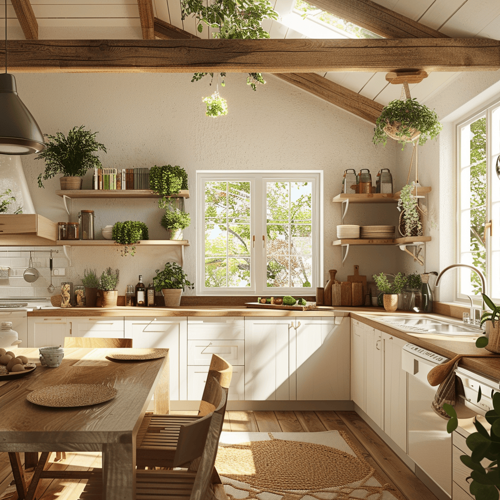
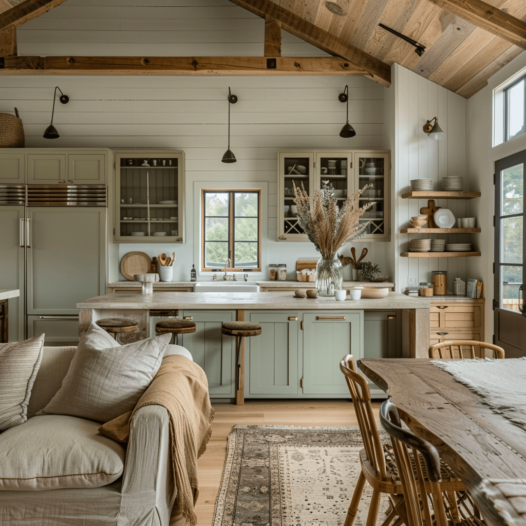
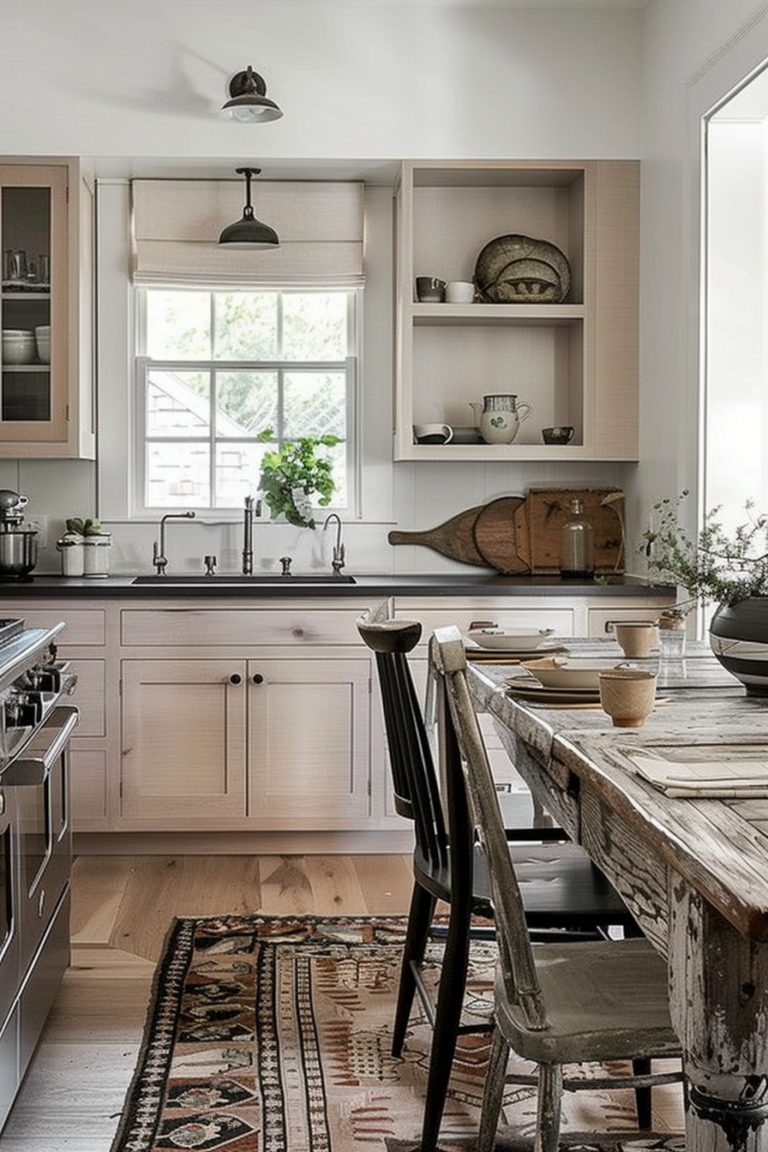
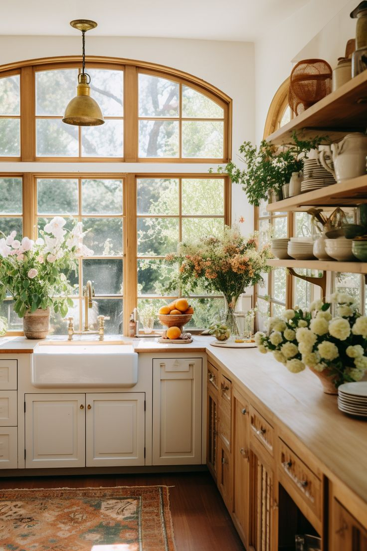
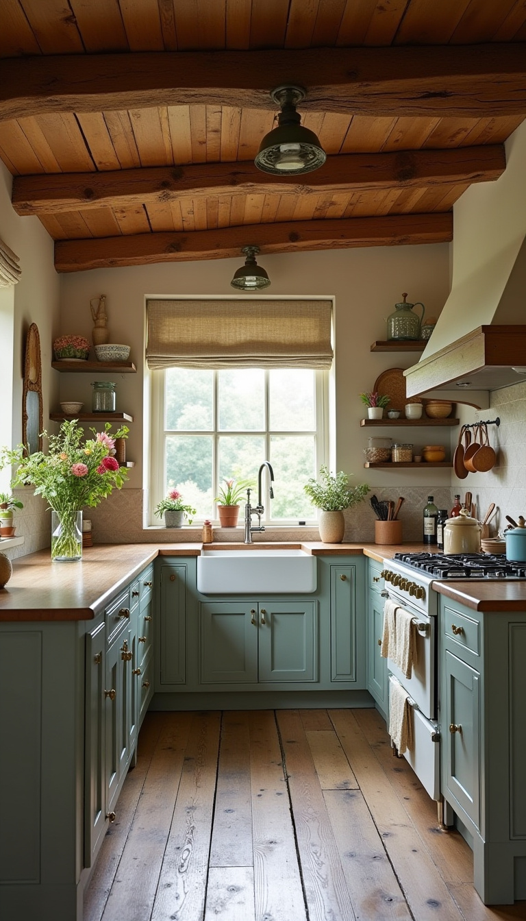
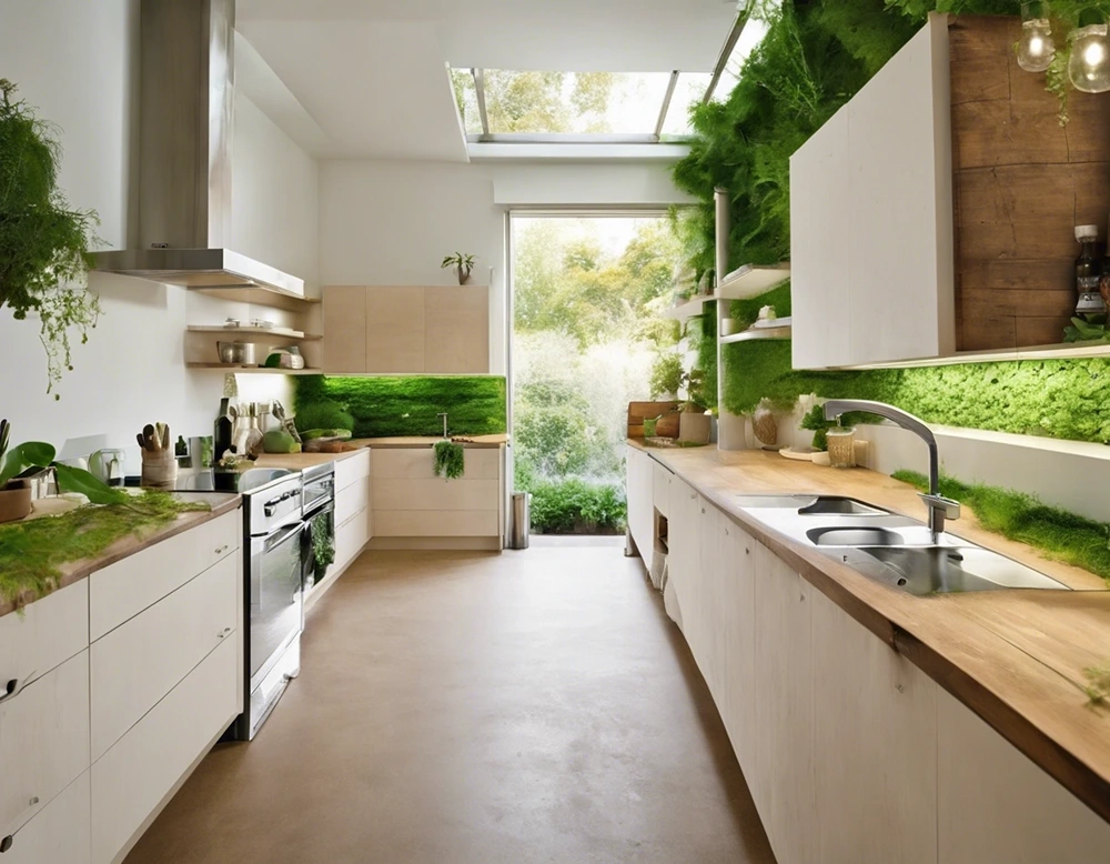
The morning light filtering through the kitchen window does not bounce off sterile white quartz or mirror-polished chrome. Instead, it catches the faint grain of white oak planks resting on cast-iron brackets, illuminating a stack of cream-colored ironstone plates and a handful of amber glass jars. There is no heavy slam of a soft-close cabinet door to shatter the quiet. There is only the tactile weight of a ceramic mug lifted directly from a ledge, and a room rendered in shades of butter-wash, bruised olive, and chalky clay.
For the better part of two decades, residential interiors pursued a kind of frictionless perfection. We built homes optimized for architectural minimalism—slab-front cabinetry that hid every trace of human habitation, stark arctic whites, and hyper-efficient layouts that looked immaculate in professional photographs but felt profoundly unlived-in. We traded physical warmth for visual velocity, designing spaces tailored more for algorithmic scrolls than for the messy, grounding rituals of daily life.
Yet the collective domestic psyche has pivoted. As the relentless hum of the digital age deepens, our spaces are reacting by softening their edges. We are witnessing a quiet, deliberate retreat into environments that feel historically anchored, emotionally resonant, and tactile. At the center of this movement are two distinct, seemingly contradictory elements: the radical exposure of open shelving and the enveloping embrace of hundred-year-old hues. Together, they represent an architecture of reassurance—a rejection of fast furniture and cold industrialism in favor of rooms that remember who we are and where we came from.
The return of exposed storage and historic colorways is not merely a nostalgic whim or a fleeting TikTok micro-trend. It is a calculated sensory response to an increasingly disembodied world. When the boundaries between work, leisure, and digital existence blur, the home must function as a sanctuary of tactile truth. Open shelving and soft hues work in tandem to strip away the artifice of modern construction, replacing synthetic gloss with patina, silence, and visual rest.
The Psychology of Exposure: Why We Stopped Hiding Our Belongings
The modern obsession with total concealment began as a quest for efficiency, but it quickly devolved into sensory starvation. When every pot, pan, spice jar, and mixing bowl is locked behind vacuum-sealed, handleless doors, the kitchen ceases to be a workshop of nourishment and transforms into a sterile laboratory. We began to crave the honesty of pre-industrial spaces where utility was visible. Open shelving answers this psychological demand by restoring transparency to our domestic routines, forcing a healthy curation of what we actually own and use.
This shift reflects a broader weariness with disposable design and mass-produced uniformity. Stacking everyday ceramics on a reclaimed timber ledge or a marble slab supported by unlacquered brass brackets introduces a human scale to the architecture. It acknowledges that a home is a collection of fragments accumulated over time, not a turnkey showroom package delivered in a box. When your dishware, cast-iron skillets, and dry-goods jars are visible, the kitchen regains its pulse. It looks used, loved, and inhabited by human hands rather than pristine ghost tenants.
At the same time, this exposure requires a delicate balancing act. The early iterations of open-concept kitchen storage often swung too far into chaotic clutter or sterile, unachievable minimalism that demanded constant styling. Today’s iteration is far more grounded. Designers are moving away from wall-to-wall floating shelves and instead treating open storage as a focused, deliberate gesture—a single run of thick white oak or soapstone-backed ledges framed by solid, handcrafted cabinetry. This hybrid approach offers the best of both worlds: the visual breathing room of exposed display paired with the functional sanctuary of concealed storage for the less photogenic essentials.
The tactile experience of reaching for an object rather than opening a mechanical drawer changes our relationship with domestic labor. Preparing a meal becomes a sensory ritual rather than a series of automated chores. The sound of a ceramic bowl meeting wood, the sight of morning light refracting through a vintage amber water pitcher, and the physical memory of where each tool lives reconnects the inhabitant to the physical space. In an era defined by touchscreens and virtual interfaces, the rough-hewn grain of an open shelf is an anchor to reality.
The Revival of Historic Palettes and 100-Year-Old Hues
Just as open shelving brings structural honesty back into the room, historic color theory is rewriting how we experience spatial volume. The reign of cool grays, stark brilliant whites, and high-contrast charcoal accents is steadily receding, replaced by complex, desaturated earth tones pulled directly from 18th- and 19th-century architectural palettes. These are not the bright primary colors of mid-century pop or the neon accents of postmodernism; they are muddy, atmospheric hues rich in calcium carbonate and natural earth pigments that shift subtly throughout the day.
These hundred-year-old colors—ranging from mustard-tinged ochres and bruised olives to dusty chalk-clays and muted, tea-stained creams—possess a unique optical quality. Because they are complex mixtures containing undertones of green, gray, or yellow, they absorb light rather than reflecting it aggressively. This creates an enveloping, cocoon-like atmosphere that lowers the collective heart rate of a room. When paired with open shelving displaying neutral ceramics and organic textures, these historic paint formulations create a seamless, cohesive canvas that feels both timeless and deeply personal.
The science behind this color shift is rooted in biophilic design and our evolutionary craving for natural environments. In the wild, pure white and high-gloss black do not exist in vast quantities; instead, our eyes evolved to process the rich, muted gradients of soil, foliage, weathered stone, and aged timber. By bringing these complex, low-saturation hues into our domestic interiors, we trick our nervous systems into a state of biological calm. The room stops shouting at us with high-contrast boundaries and instead breathes with us.
Furthermore, these historic hues interact magnificently with natural light and interior shadow. A wall painted in a limewash or mineral paint tinted to a faded sage or historic brick-dust red will catch the afternoon sun with mottled depth, developing a soft patina over time just like wood and leather. This aging-in-place quality stands in stark contrast to modern vinyl-acrylic paints that remain static and plastic-feeling from the day they are rolled on. Nostalgic color choices acknowledge that a home should look better at age ten than it did at day one.
A Practical Blueprint for Integrating Open Storage and Soft Tones
Implementing open shelving and historic hues requires a disciplined methodology. Done incorrectly, open storage descends into visual noise, while heavy historic colors can make a poorly lit room feel cavernous. Achieving the right balance demands careful spatial planning, material selection, and lighting design. The following framework outlines how to execute this design shift successfully in your own living spaces.
- Step 1 (Audit Your Material and Object Inventory): Before hanging a single bracket, evaluate the actual items you display. Discard mismatched plastic containers and cracked utility items. Invest in a cohesive collection of everyday ceramics, glassware, and cookware made from honest materials like cast iron, stoneware, clear glass, and unglazed terracotta.
- Step 2 (Choose the Right Substrate and Support): Select wood species and hardware that complement your home’s architectural era. White oak, walnut, or reclaimed Douglas fir paired with unlacquered brass, forged iron, or oiled bronze brackets provide structural integrity while anchoring the aesthetic in tactile authenticity.
- Step 3 (Select Complex, Earth-Driven Pigments): Skip the off-the-shelf designer whites and explore historic paint archives. Look for mineral-based or limewash paints featuring complex undertones—muted olives, chalky clays, warm buttery ivories, and desaturated slate blues that interact dynamically with changing natural light.
- Step 4 (Adopt the Hybrid Storage Rule): Avoid the trap of all-open layouts by maintaining lower cabinets or pantry pantries with traditional doors. Reserve open shelving for the upper 40 percent of the wall space, focusing on items used daily to prevent dust accumulation and visual clutter.
- Step 5 (Layer Task and Ambient Lighting): Integrate under-shelf picture lights, warm-temperature LED strips (around 2400K to 2700K), or classic brass sconces directly above the shelving units. Soft, directional illumination highlights the varied textures of your dishware and warms up the surrounding historic paint finish.
Navigating the Traps: Common Missteps and Field-Tested Workarounds
While the visual allure of open shelving and nostalgic colorways is undeniable, translating editorial imagery into functional reality can present unexpected challenges. Homeowners frequently encounter friction when romantic aesthetics collide with the messy practicalities of daily cooking, cleaning, and spatial constraints. Understanding these pitfalls before picking up a hammer saves both time and frustration.
- Pitfall 1 (The Dust and Grease Trap in Kitchens): Open shelves near cooking ranges quickly accumulate a sticky film of airborne grease mixed with household dust. Workaround: Restrict open shelving to prep zones or coffee bars situated well away from heavy grease-producing cooking ranges, and reserve the primary cooktop zone for closed cabinetry with powerful external extraction hoods.
- Pitfall 2 (Visual Overcrowding and Clutter): Loading shelves with too many disparate colors and shapes creates instant visual chaos that destroys the intended calm. Workaround: Apply a strict color-restraint rule by limiting displayed items to a monochromatic or tightly edited tri-tone palette (e.g., cream, terracotta, and amber).
- Pitfall 3 (Poor Weight Distribution and Sagging Shelves): Long, unsupported wooden planks laden with heavy cast-iron Dutch ovens will inevitably warp and pull away from drywall anchors. Workaround: Anchor shelf brackets directly into wall studs using heavy-duty structural screws, and limit unsupported spans to a maximum of thirty-six inches for solid wood greater than 1.5 inches in thickness.
- Pitfall 4 (Gloomy Spaces Caused by Dark Historic Hues): Painting a small, north-facing room in a deeply saturated historic olive or muddy brown can make the space feel oppressive rather than cozy. Workaround: Reserve deep historic shades for south-facing rooms flooded with bright natural light, or opt for higher-LRV (Light Reflectance Value) variants of historic creams and soft clays in smaller, darker spaces.
- Pitfall 5 (The Impracticality of Daily Retrieval): Storing infrequently used holiday platters on high open shelves forces awkward reaching and risks breakage. Workaround: Keep everyday items—mugs, bowls, dinner plates—at comfortable chest-to-eye-level reach, leaving the highest tiers for purely decorative, lightweight vintage vessels.
The Broader Cultural Pivot Toward Sustainable Permanence
The embrace of nostalgic design elements points to a fundamental shift in our economic and cultural relationship with the built environment. For decades, interior design operated on a fast-furniture cycle modeled after the fast-fashion industry—disposable trends manufactured overseas, shipped flat, and discarded after three years when the algorithm dictated a new aesthetic shift. Open shelving and heritage color palettes represent a direct rebellion against this planned obsolescence.
When you install solid wood shelving custom-fitted to your wall and finish your plaster walls with breathable, mineral-rich limewash, you are investing in materials that improve with age. Unlacquered brass tarnishes and develops a living finish with every touch; oak darkens gracefully under UV exposure; ironstone acquires faint crazing that tells the story of thousands of family dinners. This is the antithesis of the pristine, factory-sealed plastic laminate that dominates mass-market home improvement stores.
Economically and ecologically, this trend signals a return to repairability and local craftsmanship. Homeowners are increasingly seeking out local woodworkers, independent ceramicists, and heritage paint makers whose products carry a traceable provenance. This localized supply chain reduces carbon footprints while infusing the home with unique stories. A shelf made from a reclaimed barn beam or a wall rendered in custom-mixed earth pigments connects the inhabitant to a regional landscape, grounding them in a world that extends far beyond their immediate zip code.
This movement also reflects a changing approach to interior permanence. Rather than gutting a kitchen every decade to keep up with shifting architectural fads, designers are creating flexible, enduring spaces that can easily adapt to new layers of life. A room built on historic color foundations and honest structural elements acts as a resilient backdrop. It absorbs changing furniture styles, evolving art collections, and decades of personal history without ever feeling dated or out of place.
Strategic Frameworks for Crafting an Enduring, Comfort-Driven Interior
Transforming your home into a sanctuary of nostalgic comfort requires more than simply buying vintage decor or painting a single accent wall. It demands a holistic design philosophy that coordinates lighting, spatial ergonomics, material honesty, and emotional resonance. To achieve a space that feels both historically grounded and impeccably functional, consider the following structural recommendations.
First, evaluate your home’s natural architectural bones. If you live in a mid-century ranch, a Victorian brownstone, or a contemporary suburban build, your design choices should nod to the structural reality of the architecture rather than imposing a forced, artificial theme. Open shelving in a modern loft can feature sleek steel and rich walnut, while a country cottage benefits from thick-cut pine and hand-forged wrought iron. Authenticity arises when materials converse naturally with their structural context.
Second, prioritize the sensory hierarchy of the room. Design is not just a visual medium; it is tactile, acoustic, and olfactory. Pair the matte finish of historic limewash walls with natural woven textiles like unbleached linen, wool rugs, and untreated leather. Introduce organic scents through beeswax candles, fresh herbs in terracotta pots, and natural wood smoke. These sensory layers trick the brain into experiencing the home as a living, breathing ecosystem rather than a static visual display.
Third, curate with ruthless patience. The greatest enemy of the open-shelving movement is accumulation without intention. Resist the urge to fill every linear inch of shelf space immediately. Leave breathing room between stacks of plates. Allow empty walls to remain bare, letting the subtle texture of historic paint finishes take center stage. A well-designed room knows when to stop talking and simply allow its inhabitants to rest.
Finally, embrace the beauty of imperfection. Modern design has conditioned us to fear chips in ceramic glaze, patina on brass, and minor variations in wall texture. The nostalgic turn invites us to let go of this anxiety. A home that shows the gentle wear of human hands is a home that is truly lived in, loved, and anchored in reality.
The turn toward open shelving and soft, historic hues is ultimately a search for sanctuary. In an era where our professional and personal lives are increasingly mediated by flat glass screens and rapid-fire data streams, our homes are stepping up to provide the tactile counterweight we desperately need. They are reminding us of the profound satisfaction found in physical weight, honest materials, and colors that have endured for centuries.
This design movement is not about retreating into the past out of fear, but rather about selectively mining history for the wisdom it offers on human scale and emotional comfort. By stripping away unnecessary artifice and embracing materials that age with grace, we create spaces that do more than simply look beautiful in photographs. We build environments that hold us, ground us, and allow us to exhale.
As we look toward the future of residential design, the homes that will sustain us are those that prioritize permanence over polish, and emotional resonance over algorithmic perfection. Whether you are remodeling an entire kitchen or simply rethinking a single corner of your living room, remember that the most successful spaces are those that reflect not just a trend, but a deeply human way of living.