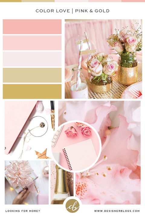
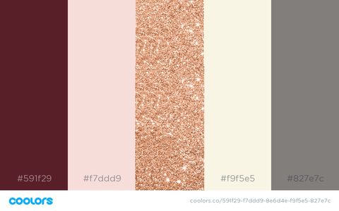
Rose gold isn’t just trendy—it’s a sophisticated choice that demands the right companions. Think of it like choosing the perfect outfit for a special occasion. You want everything to work together, not compete. When you get the colors right, rose gold becomes the star of any room or design project.
There’s something undeniably elegant about rose gold that makes it stand out from traditional metals. It’s warm, inviting, and has that perfect balance between vintage charm and modern sophistication. But here’s the thing—rose gold is like a chameleon when it comes to color coordination. Get it wrong, and it can look jarring or out of place. Get it right, and suddenly you’ve got a design masterpiece that feels both luxurious and approachable. The secret lies in understanding how to pair rose gold with other colors to create harmony rather than chaos.
The Science Behind Rose Gold’s Color Appeal
Rose gold’s distinctive hue comes from its unique alloy composition. It’s essentially a blend of copper and silver, with the copper giving it that warm, pinkish tone. This isn’t just chemistry—it’s psychology too. Our brains associate warm colors with comfort and luxury. The copper component creates a subtle undertone that makes rose gold feel richer than plain gold, while still maintaining that delicate touch that makes it so versatile. Consider how it catches light differently than traditional gold. It seems to glow with a soft warmth that draws attention without being overwhelming. That’s why when you see rose gold in jewelry, home decor, or even fashion, it instantly feels premium and thoughtful.
Timeless Complements That Never Disappoint
Some color combinations with rose gold have stood the test of time. Think classic neutrals like cream, beige, and warm whites. These provide a clean backdrop that lets rose gold shine without competing for attention. The contrast between the warm tones and cool backgrounds creates visual interest that’s pleasing to the eye. For instance, imagine a rose gold coffee table surrounded by cream-colored sofas and warm wood tones. The result? A cohesive, welcoming space that feels both modern and timeless. Another reliable pairing is deep navy blue. This combination works because navy is a rich, saturated color that balances rose gold’s softer warmth. It’s like having two sides of the same coin—complementary yet distinct.
Modern Bold Choices That Pop
Don’t be afraid to experiment with bolder color choices. Emerald green is surprisingly beautiful with rose gold. The deep, rich green creates a sophisticated contrast that feels both fresh and classic. Picture a rose gold pendant against a dark emerald background—how does that sound? Or try pairing rose gold with coral or terracotta. These warm earth tones amplify the copper elements in rose gold, creating a vibrant, energetic look that feels contemporary and exciting. The key is moderation. You don’t want to overwhelm the rose gold with too many competing colors. Let one bold element be the star while others provide support.
The Art of Neutral Harmony
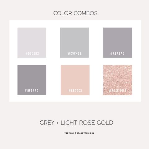
Neutral palettes are where rose gold truly excels. Warm grays, soft browns, and muted taupe all work beautifully with rose gold. These colors create a sense of calm and sophistication that allows rose gold to be the focal point. Think of how a rose gold watch looks against a neutral gray background versus a bright red one. The difference is dramatic. Neutrals also give you flexibility in your overall design scheme. You can change other elements in your space without worrying about disrupting the rose gold’s presence. This makes them ideal for spaces where you want to maintain a consistent, polished look over time.
Cool Contrast Techniques
Sometimes the most striking combinations come from surprising contrasts. Cool colors like soft blues and pale greens can make rose gold appear even more vibrant. This happens because the cooler tones help highlight the warm undertones in rose gold. Imagine a rose gold frame on a white wall with pale blue accents. The result is a design that feels fresh and airy while still maintaining that luxurious feel. The trick is using these cool tones sparingly. Too much can make the rose gold look cold or disconnected. Instead, use them strategically to create depth and dimension in your space.
Practical Tips for Real-World Application
When working with rose gold, start small. Test color combinations in a small area first before committing to larger projects. This way, you can see how the colors interact in different lighting conditions throughout the day. Pay attention to how rose gold looks in both natural and artificial light. What looks great in morning sunlight might seem different under evening lamps. Also consider the texture of materials. Smooth rose gold surfaces reflect light differently than matte finishes, affecting how colors appear around them. For example, a rose gold cabinet with a glossy finish will look different next to a warm wood tone compared to a matte finish. Finally, remember that less is often more. You don’t need to match every single element perfectly. Sometimes the magic happens when you let rose gold be the anchor while other colors play supporting roles.
Understanding how to work with rose gold’s color palette opens up a world of creative possibilities. Whether you’re designing a room, selecting jewelry, or planning a fashion ensemble, the principles remain the same. The key is finding that balance between complementing and contrasting colors to create visual harmony. Rose gold’s versatility means it can work with everything from soft pastels to rich jewel tones. It’s about knowing when to let it shine and when to let other elements take center stage. With the right color choices, rose gold becomes more than just a metal—it becomes a statement of taste and sophistication. So next time you encounter rose gold, think beyond its metallic appeal and consider how its color properties can elevate your entire aesthetic vision.


